You probably know ‘This Old House’ as the PBS TV show focused on bringing dilapidated old homes back from the brink of despair. They make it look easy. So easy. The show has been airing since 1979, and is still going strong. I was introduced to its glory by watching episodes every Sunday with my dad in our living room. The show really helped to harbor my love for residential design and appreciation of fine craftsmanship.
In 2015 the show branched out from renovations and built the very first IDEA HOUSE, a bright blue storybook cottage.
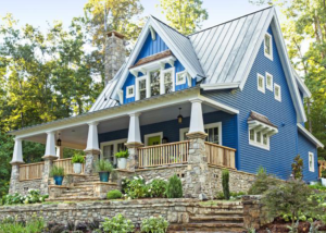
I remember being drawn in to the charm of the home when I saw the feature in the magazine (yes, I have a subscription!), and I was really blown away at how well it had been executed. This Old House had gone NEW! They released the 2016 IDEA HOUSE the following year, a modern farmhouse styled home which was jam packed with energy efficiency.
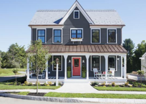
I anticipated the 2017 IDEA HOUSE, and was excited to see a 14 page spread of the design in the October issue of the magazine! It is a Rhode Island beach house in the classic coastal style. Isn’t it stunning?
***all photos are property of This Old House***
.png)
After reading the article, and snooping around on the TOH website a bit, I’m ready to share with all of you my list of 10 home design tips to take away from the 2017 This Old House Idea House.
.png)
1. DESIGN FOR MULTIPLE GENERATIONS: Though multi-generational housing is quite common in most areas of the world, it has only recently become a trending concept in America. Perhaps it is an increased need to care for aging parents or a desire for families to cut down on housing costs driving this shift. Whatever the reason, it makes sense to plan for multiple future scenarios, even if it isn’t necessarily something that is needed for you right now. To accomplish this, the Idea Home cleverly situated bedroom and living spaces on multiple levels -allowing for privacy and connection at the same time. The bonus space above the garage, currently set up as a game room, could easily be converted to a studio apartment for a young adult not quite ready to fly the nest, or for aging parents who need some extra day to day help..jpg)
2. ALLOW THE CHARACTER OF THE REGION TO INFLUENCE YOUR HOMES EXTERIOR: A quaint log cabin would look out of place in a metropolitan setting, but graceful on a wooded lot. Natural and built elements in the immediate surroundings should be considered when designing your home. The designers of the Idea House hit the nail on the head by choosing a classic seaside shingle style for the home’s location near the ocean. .jpg)
3. INCORPORATE TRADITIONAL INFLUENCES INTO NEW HOME CONSTRUCTION: Classic homes offer visual interest and unique angles that aren’t typically adopted in new builds. It is worth the effort to find builders who can incorporate detail, and the This Old House team did just that. The use of a wrap around porch, intricate gambrel roofs, shake siding, curving walls, and a unique eyebrow window add up to create a home that is not only beautiful, but personable. 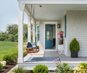
4. CREATE DEFINITION FOR INTERIOR SPACES: Although open concept floor plans are popular in today’s new homes, often times they make for an expansive space that feels lifeless and lacks intimacy. The Idea House cleverly uses ceiling design, partial walls, and columns to create defined spaces within the larger open plan. Sight lines remain open from one room to the next, but there is a coziness that is added by this extra layer of detail. .jpg)
5. DESIGN FOR ONE LEVEL LIVING / AGING IN PLACE: Going a bit further with the idea of designing for multiple generations under one roof, the Idea House team was also mindful that the family who eventually lives in this house may desire to stay there long term (who wouldn’t?). Concepts such as using minimal stairs from the garage to the house and from the house to outdoor spaces, plus the addition of a first floor bedroom suite, drive this practice. Smaller details to make everyday life a bit easier for the older generation, such as lever style handles and a curbless walk in shower, were also incorporated. 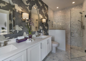
6. CUSTOMIZE YOUR HOME TO FIT YOUR LIFESTYLE: Again, this house was designed for a typical family – but not with one particular family in mind. That being said, the space is far from generic. There are details throughout the house that suggest how customizing could benefit. One such example is the dog washing station in the mudroom. A feature such as this can really bring a standard house into ‘home’ status, by allowing it to function in the way the family who lives there needs it to.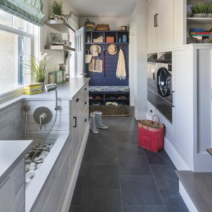
7. USE A COHESIVE COLOR PALETTE: Color helps to tie things together, and this house utilizes coordinating color palettes and decorating motifs seamlessly. There is definitely a ‘beachy’ vibe going on with a variety of blue hues and drift wood accents. The kitchen is sleek but playful with its seaside glass tile back-splash; and the master bathroom gets in on the theme with fanciful sea creature wallpaper!.png)
8. PROVIDE AN INDOOR/OUTDOOR CONNECTION: Nobody wants to feel like they are living in a box. With the advancement of glazing and insulation, larger windows are now a reality of home construction – and providing stunning views from inside the home to the natural world is a desirable attribute. The Idea House takes the concept of connection a step further by locating a gorgeous screened in porch directly off of the living room. With its vaulted ceiling and cozy fireplace, it is sure to be a family favorite nearly year-round! .jpg)
9. UTILIZE MODERN TECHNOLOGY: The advances that have been made in technology recently are incredible, and the housing market is also seeing benefits from this development. The Idea House takes technology to the next level by incorporating a thermostat in each individual room with a VRF system, which provides room by room comfort and offers an estimated cost savings of 40% over conventional heating systems. The thermostats are controlled by a smartphone app. The security system is also top notch, with plenty of smart features that will ensure that the family who eventually lives in the home will feel safe and secure..png)
10. MAKE THE MOST OF EVERY SQUARE INCH: Though the house is a generous size, the designers made sure that every bit of the 3,000+ square feet is functional. In the bunk room, built in beds were crafted in the space under the eaves, providing a cozy and charming spot for children or visitors to sleep. Personally, I’m pretty sure the bunk room would be my fave spot to hang out. Just take a look!.jpg)
There you have it, 10 amazing house design ideas! As always, This Old House did not disappoint! The level of innovation, detail and character of this home are in line with that standard of excellence we have come to expect from the TOH team.
Want a closer look at the house? I encourage you to visit the This Old House Website to see the floor plans and check out a virtual tour, which allows you to look 360 degrees around each room. Very cool! They also documented each step of the construction and design process, including the installation of shingle siding, the building of the intricate chippendale railing, and discussion of what elements influenced the home’s overall color palette.
Stay tuned, the next project they are tackling looks to be just as intriguing! Get a sneak peek here. Spoiler alert! Mike Rowe makes an appearance!


